Social graphs - scary and beautiful
If you are on Facebook you might have seen pictures from your friends where they post their "social graph"? These are indeed beautiful illustrations of your friend's network, and below I point to a few of the available "click and view" apps that will do this for you.
From all of these you will be able to quickly get an overview of your social network, and often you will be able to identify groups among your friends. As a bonus you will also find a tool that displays your social graph on LinkedIn.
But these are not only nice visualizations. They also invite to a moment of thought on how much a simple list of your friends, and how your friends know each other, can reveal. After presenting three visualization tools for Facebook I'll discuss a bit more about this. But first the tools:
 myFnetwork
This visualization is the simplest of the tools. No interactivity, but you can zoom and pan around in the picture. Individual nodes are colour-coded based on some centrality measurement - the more yellow/white, the more connected to the surrounding nodes.
All nodes are placed in a circular patten, and you can identify some of the major clusters among your friends.
You can try myFnetwork here (link).
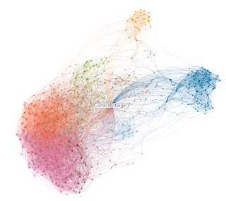
Social graph
 This tool provides some interactivity, and includes the image of each friend in the visualization. The clusters of friends are more easily explorable, and some of the more obvious clusters are highlighted with pink circles.
You can hoover over a node to see the name of that specific friend. A click on a node will bring you to the corresponding Facebook profile. By clicking and holding down the mouse button you can grab a node and move it around to see which other nodes/friends that are connected.
Try Social graph here (link).
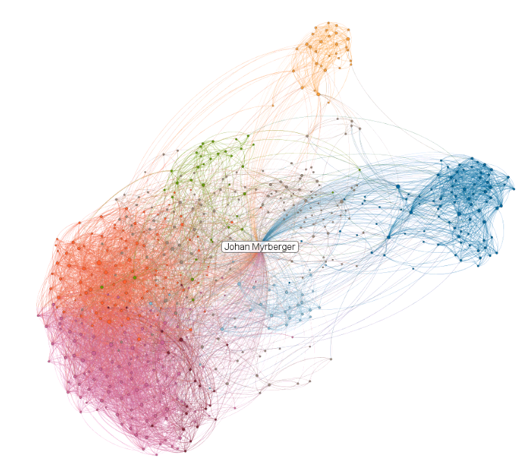
TouchGraph
 The last Facebook tool to visualize you social graph is also the most advanced.
It does a nice job in colour-coding different clusters in your network and gives the nodes different sizes (which seems to be related to the number of friends in your network (degree)).
The graph is interactive, and can be configured and explored in a number of ways. Note that by default it also includes yourself as a node, but that can be changed in the advanced settings.
TouchGraph can be found here (link).
Some theory...
All of the graphs above are sometimes referred to as egocentric, level 1.5, social graphs. This means that the start form an ego (you) - but as you are obviously connected to all your friends it doesn't add any information to include yourself (rather, including yourself will in many cases make the network structure less obvious). 1.5 means that the network includes all of your friends (level 1), and how your friends are connected to each other (level 1.5). A level 2 would mean including all of your friend's friends, also those that not are connected to you. This has some further value, but on the other hand the Facebook API does not provide access to this information, and the number of nodes would quickly be very large.
It is quite obvious that by only looking at your friends, and how they know each other, you find some interesting patterns. Especially the groups (clusters) usually match very well to real life social groups.
The clusters are most often visualized by a combination of a layout algorithm, where groups will form, and by specific algorithms designed to calculate clusters.
With other tools you can take the analysis to the next level - there is a number of metrics that can be applied to these kind of graphs - but that is probably a topic for a future blog post.
...and the scary part!
Well, isn't the scary part clear by now?
Simply by looking at your friends, and how they are connected to each other, a lot can be seen. The relationship and context of a specific friend can be deducted in many cases. If you know one node that is in your family, you are likely to find the other family members in the same cluster.
Probably obvious to you, but as your social graph information is more or less openly available (on Facebook, but also on LinkedIn, Twitter and other networks) it is not that hard for anyone to have a closer look. And of course the network operator have a very nice picture of you - not only from what you "post and like", but especially from your social graph.
The bonus - a LinkedIn tool
 Oh - yes - I promised you to also include a tool to visualize your social graph on LinkedIn. You can find the tool here (link). It is very similar to the other tools above, but instead looks at your LinkedIn social graph.
The main difference, besides the nodes and network as such, is that this tool include yourself as a node.
It does a good job in identifying clusters in your more professional network. (Note, you need at least 50 connections on LinkedIn to be able to use it).
Now it's your turn
Go ahead and try one or more of the social graph visualization tools I mention here. I'd love to hear your viewpoints, just leave a comment!
Also, if you know any other nice tool to visualize various social graphs I'd be interested.
From all of these you will be able to quickly get an overview of your social network, and often you will be able to identify groups among your friends. As a bonus you will also find a tool that displays your social graph on LinkedIn.
But these are not only nice visualizations. They also invite to a moment of thought on how much a simple list of your friends, and how your friends know each other, can reveal. After presenting three visualization tools for Facebook I'll discuss a bit more about this. But first the tools:

This visualization is the simplest of the tools. No interactivity, but you can zoom and pan around in the picture. Individual nodes are colour-coded based on some centrality measurement - the more yellow/white, the more connected to the surrounding nodes.
All nodes are placed in a circular patten, and you can identify some of the major clusters among your friends.
You can try myFnetwork here (link).
Social graph

You can hoover over a node to see the name of that specific friend. A click on a node will bring you to the corresponding Facebook profile. By clicking and holding down the mouse button you can grab a node and move it around to see which other nodes/friends that are connected.
Try Social graph here (link).
TouchGraph

It does a nice job in colour-coding different clusters in your network and gives the nodes different sizes (which seems to be related to the number of friends in your network (degree)).
The graph is interactive, and can be configured and explored in a number of ways. Note that by default it also includes yourself as a node, but that can be changed in the advanced settings.
TouchGraph can be found here (link).
Some theory...
All of the graphs above are sometimes referred to as egocentric, level 1.5, social graphs. This means that the start form an ego (you) - but as you are obviously connected to all your friends it doesn't add any information to include yourself (rather, including yourself will in many cases make the network structure less obvious). 1.5 means that the network includes all of your friends (level 1), and how your friends are connected to each other (level 1.5). A level 2 would mean including all of your friend's friends, also those that not are connected to you. This has some further value, but on the other hand the Facebook API does not provide access to this information, and the number of nodes would quickly be very large.
It is quite obvious that by only looking at your friends, and how they know each other, you find some interesting patterns. Especially the groups (clusters) usually match very well to real life social groups.
The clusters are most often visualized by a combination of a layout algorithm, where groups will form, and by specific algorithms designed to calculate clusters.
With other tools you can take the analysis to the next level - there is a number of metrics that can be applied to these kind of graphs - but that is probably a topic for a future blog post.
...and the scary part!
Well, isn't the scary part clear by now?
Simply by looking at your friends, and how they are connected to each other, a lot can be seen. The relationship and context of a specific friend can be deducted in many cases. If you know one node that is in your family, you are likely to find the other family members in the same cluster.
Probably obvious to you, but as your social graph information is more or less openly available (on Facebook, but also on LinkedIn, Twitter and other networks) it is not that hard for anyone to have a closer look. And of course the network operator have a very nice picture of you - not only from what you "post and like", but especially from your social graph.
The bonus - a LinkedIn tool
 Oh - yes - I promised you to also include a tool to visualize your social graph on LinkedIn. You can find the tool here (link). It is very similar to the other tools above, but instead looks at your LinkedIn social graph.
The main difference, besides the nodes and network as such, is that this tool include yourself as a node.
It does a good job in identifying clusters in your more professional network. (Note, you need at least 50 connections on LinkedIn to be able to use it).
Now it's your turn
Go ahead and try one or more of the social graph visualization tools I mention here. I'd love to hear your viewpoints, just leave a comment!
Also, if you know any other nice tool to visualize various social graphs I'd be interested.
Labels: facebook, LinkedIn, networked society, social graph
posted by Johan Myrberger at
1:14 PM
![]()


5 Comments:
Cool! But you forgot one of the best tool for visualizing your friends graph :) This works really nice and the color coding is amazing!
apps.facebook.com/friendsgraph
Thanks, that was a new one to me, quite nice. Liked the cluster part, which identified the groups fairly well.
However it would be good if the graph could be configured to exclude the "self" node. I believe it would reveal further information about the clusters.
It looks like this app is dead. I tried to access the app and I got
"Sorry, this page isn't available
The link you followed may be broken, or the page may have been removed."
I've seen posts on the main FB page, asking the owners if it's dead or not, with no reply.
Marty,
I have noticed that the links to apps have stared to "fail", but have not updated the post.
The post was written three years ago, and Internet has appearlntly moved on in these cases...
(Sorry for late moderation/reply of your comment)
Have you tried Tableau? they shoudl have 2 freebie versons for visualization of data...
Post a Comment
Subscribe to Post Comments [Atom]
<< Home