Facebook statistics and Google Motion Chart
The news includes:
- Statistics for more countries
During May Facebook added 26 countries to the SocialAd tool, bringing up the total to 81 countries.
New countries are: Bangladesh, Bolivia, Bulgaria, Costa Rica, Cyprus, Czech Republic, Ecuador, El Salvador, Guatemala, Honduras, Hungary, Jamaica, Kenya, Lithuania, Luxembourg, Morocco, Nicaragua, Paraguay, Portugal, Qatar, Romania, Slovakia, Slovenia, Sri Lanka, Trinidad and Tobago, and finally Uruguay.
- Facebook translated into more languages
Spanish was first out, followed by German and French. Now a total of 16 languages are supported, including all of the Nordic languages. See list to the right. - New numbers used for population and Internet usage
I updated the country population numbers used with the July 2008 estimate from the CIA Factbook. And also for the numbers on internet penetration I used the latest information from Internet World Stats. - Gapminder tool available as Google Motion Chart
Since I started collecting the Facebook statistics I have been waiting for this. You might recall my post about Statistical Storytelling, where I mentioned the Gapminder tool that was acquired by Google. Now this tool is available as a graph option inside Google Spreadsheets, and naturally that's what I now use to present the information.
So, on to the statistics! This time I only made a chart for a single date (March 30th, 2008), but naturally the next step is to take advantage of the Motion Chart capabilities by adding historical data, so we can see how the patterns changes over time.
Below you will find the interactive chart. (If you are reading the feed of this blog the embedded chart might not turn up, go here instead).
A larger version is available here. Play around with it and see what you find, to guide you I have made some screenshots further down. Also an explanation of the available indicators are below.
If you find something interesting, or have a suggestion for further data that might be interesting to add, let me know!
The chart should initially look like the screenshot below, except for the country names. You can get the country name for each bubble by hoovering over it, and by clicking on a bubble the name will stick.
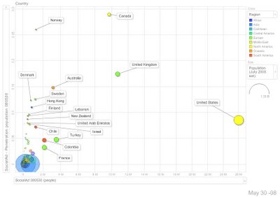 This view has the number of Facebook users per country on the x-axis, and the Facebook penetration (of country population) on the y-axis. The size of the bubble is the population of the country, and the colour is simple which region the country belongs to.
US, UK and Canada are the top three countries when you look at numberof Facebook users. looking at the Facebook penetration among the population in a country the top three are Canada, Norway and UK. The two large blue bubbles bottom left are India and China.
Now, let's keep the data for the two axis (each country will keep its position) and change the colour to represent the relative growth the last two weeks, and the size to represent the absolute growth the same period.
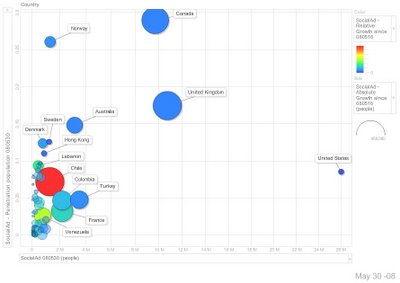 You see three rather big bubbles (Canada, UK and Chile), representing the countries which added more that 400 000 users since March 16th. And notice the red colour of Chile, indicating the highest relative growth (close to 60%) - the blueish colour of UK and Canada represents a relaive growth of only 4.4%
To dig further into where the Facebook growth is at the moment we keep all settings but for the x-axis, which we make represent the rank of the relative growth (each country get the position of its current relative growth, meaning the highest growth (#1) is the leftmost bubble). To further focus on the high growth countries we turn the scale of the x-axis into a log scale.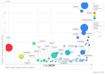
This way you can visualize up to four parameters in the same graph and look for patterns and trends. It is easy to create scattered views that not really adds any value, so be careful.
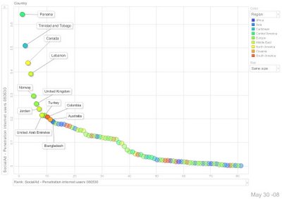
You can also have a look at a single parameter only. Below we used the region as the colour and set the size to be the same for all bubbles. On the y-axis we map the penetration of Facebook users among the internet users in each country, and on the x-axis we simply used the rank of the same indicator (no log scale this time). This makes it easy to study this single parameter.
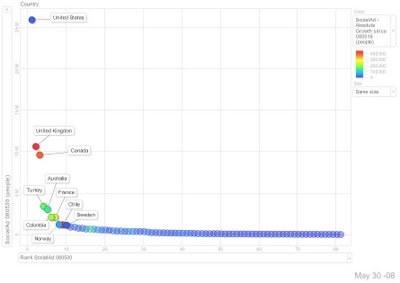
In a similar way you can view the two parameters we used initially (Facebook penetration per country population and the number of Facebook users) separately.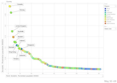
Now it's your turn. Play around and find some facts! There's more parameters available than the ones we used above. When you find something worth noticing leave a comment here. Also let me know if I shall add any further data to play around with.
And stay tuned for next post, adding the historical data will make this even more fun.
Here is an explanation of available parameters:
(As the tables will not get indexed I add this: Facebook statistics, usage, penetration for Turkey Israel France Malaysia Singapore China Switzerland Colombia Italy Germany India Spain Ireland Netherlands Australia Saudi Arabia New Zealand Mexico Egypt Lebanon United Arab Emirates UAE Pakistan Dominican Republic Japan Sweden South Korea, Republic of Korea United Kingdom UK Norway United States (US) South Africa Canada Philippines Indonesia Russian Federation (Russia) Greece Denmark Finland Chile Belgium Argentina Venezuela Austria Jordan Peru Kuwait Thailand Panama Brazil Croatia Hong Kong Nigeria Poland Serbia Taiwan Bangladesh, Bolivia, Bulgaria, Costa Rica, Cyprus, Czech Republic, Ecuador, El Salvador, Guatemala, Honduras, Hungary, Jamaica, Kenya, Lithuania, Luxembourg, Morocco, Nicaragua, Paraguay, Portugal, Qatar, Romania, Slovakia, Slovenia, Sri Lanka, Tinidad and Tobago,Uruguay)
Labels: facebookstats
posted by Johan Myrberger at
5:45 PM
6 Comments
![]()

